Problem
Legacy portal complexity created support call surges (61% regarding transaction status) and deterred younger investors.

Modern mobile investing for a SEBI-registered brokerage, built for a younger investor.
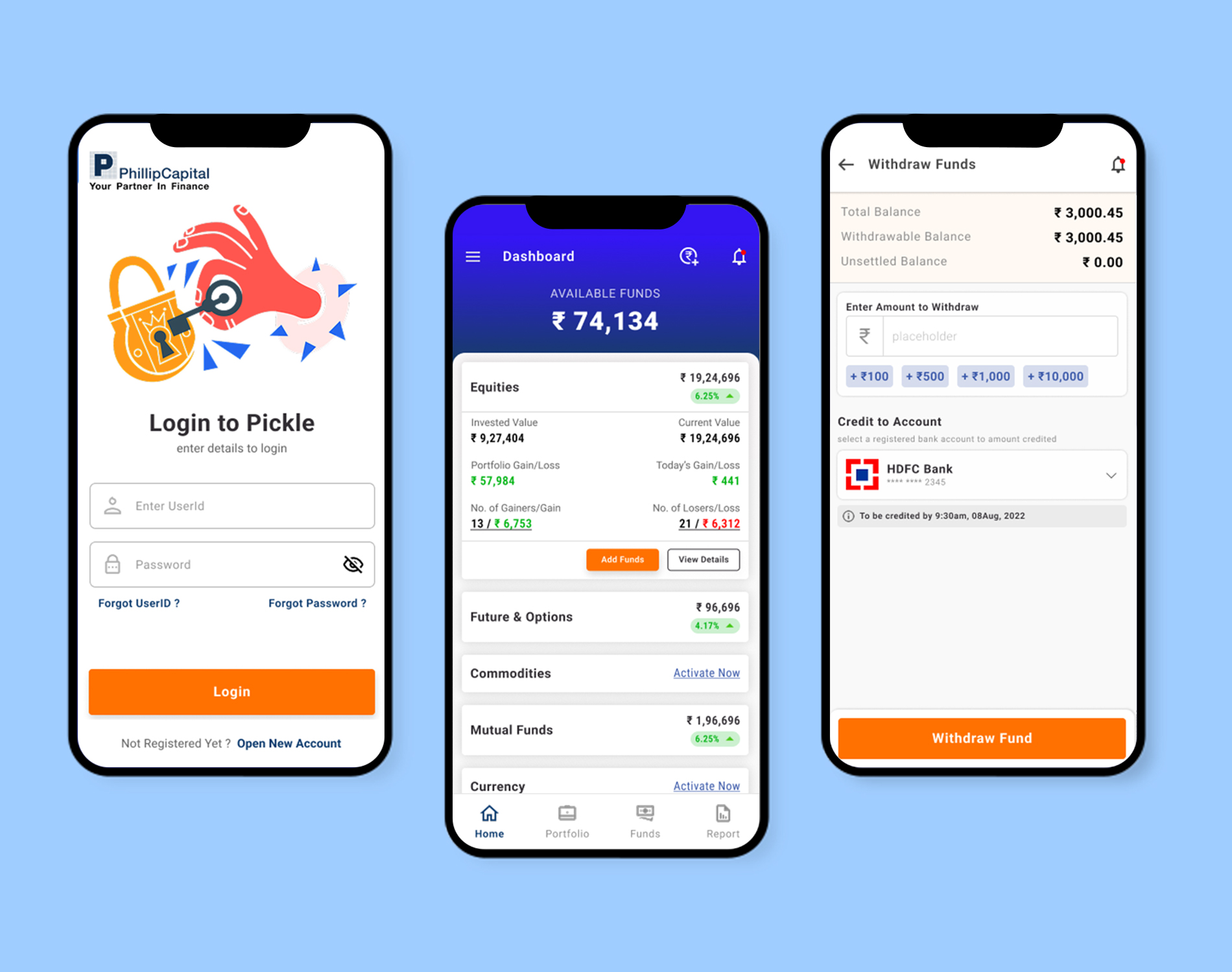
Phillip One is the mobile investing app for Phillip Capital India, a SEBI-registered full-service brokerage with operations across equities, mutual funds, and derivatives. The product brief was to build a clean, modern investment interface that could attract a younger, digitally native investor segment while remaining compliant with SEBI regulations. I was brought in as the UX/UI lead for the initial release, responsible for the portfolio overview, transaction flows, SIP management, and onboarding experience.
Investment apps sit at an awkward intersection: users need access to large amounts of data, but too much data creates paralysis. Phillip Capital’s existing web portal was built for professional traders — it had every feature imaginable but required a two-hour orientation for a new user. The brief was to create a mobile-native experience that served the most important 20% of use cases for 80% of users while integrating SEBI-mandated disclosures seamlessly.
Legacy portal complexity created support call surges (61% regarding transaction status) and deterred younger investors.
A goal-led mobile application providing transparent portfolio performance, simplified SIP management, and compliant SEBI disclosures.
61% drop in transaction-related support calls, 2.8x higher SIP registrations, and 28% adoption from younger investors.
Analysis of call centre logs revealed that 61% of support tickets stemmed from post-investment confusion (e.g., pending order states, SIP execution status). Interviews with retail investors aged 26–45 indicated that users think in goals rather than asset classes, prompting a pivot in information architecture.
Support data opened the strategy: 61% of calls were about understanding a transaction. So the strategy rejected growth-play conventions — colourful discovery feeds, impulse-buying rails — and concentrated on making what the user already owns feel as well-designed as the buying flow.
Focused on portfolio check and SIP review on the commute.
Reorganised navigation around financial targets rather than raw asset categories.
Made holdings and order execution tracking the best-designed surfaces in the product.
Chosen for total clarity and lack of visual ambiguity over trendy visual aesthetics.
SEBI-mandated warnings were integrated natively where decisions occur.
Client success teams walked flows early to catch real-world support bottlenecks.
Optimised login for fast re-entry during daily commutes without breaking KYC security.

net invested value, current value, and absolute P&L on a single home screen.
active SIP listing with next instalment dates, modification flow, and pause controls.
goal-based fund browsing with risk category labelling.
watchlist-to-trade flow with market depth and position tracking.
custom stock and fund lists with live price feeds.
chronological log of investments, redemptions, and dividends.
monthly portfolio statements downloadable as PDF.
guided questionnaire establishing risk appetite.
goal-based SIP calculator projecting corpus at target date.
biometric and mPIN login with SEBI-compliant session timeout.
curated market news and research notes from Phillip Capital.
real-time execution status for placed orders.
UPI and NACH mandate setup and status tracking.
capital gains statement download for ITR filing.
Support calls about transaction clarity dropped 61%, SIP registrations per user reached 2.8× the web-portal average, and the 25–35 age segment contributed 28% of new accounts in the first quarter.
In high-stakes financial contexts, clarity is vastly more valuable than visual ornament. Involving customer support teams in UX reviews uncovered operational friction points far faster than traditional user research.