Problem
Static templates buried trust signals (RERA, delivery track record), lost 60%+ mobile traffic, and generated unqualified lead dumps.
A premium web presence for a real estate developer - projects, leads, and speed.
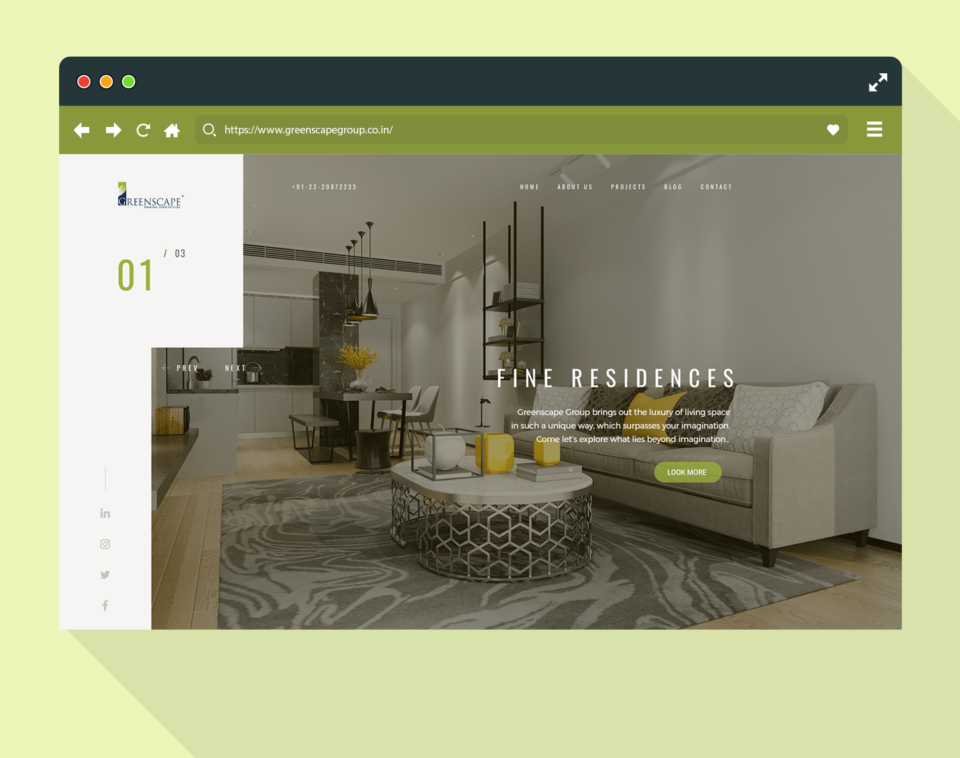
Greenscape Group is a real estate developer based in Navi Mumbai with a portfolio of commercial IT parks (Cyber One, Cyber Code) and luxury residential developments. They approached me to redesign their web presence — their existing site was a template-based brochure that had not been updated in three years and was actively losing enquiries to competitors. The brief was to build a site that could present ongoing and completed projects, capture qualified leads, and position Greenscape as a premium developer. I led design and front-end strategy across a twelve-week project. The final site introduced an interactive project showcase, a unit finder, and a lead enquiry system built to Google’s Core Web Vitals standards.
Buyers make one of the largest financial decisions of their lives through a screen before visiting the site. Greenscape’s old site was a grid of static images and a contact form with no mobile optimization (despite 60%+ mobile traffic). Leads sent to a generic email were handled manually with zero qualification. Completed projects were unlisted, and ongoing developments lacked floor plan galleries or RERA compliance details.
Static templates buried trust signals (RERA, delivery track record), lost 60%+ mobile traffic, and generated unqualified lead dumps.
A fast, content-driven site leading with developer trust signals, neighborhood maps, interactive unit finders, and direct WhatsApp CTAs.
+58% lead form submissions, 3.2x longer session duration on project pages, and 100% Core Web Vitals pass rate.
A heuristic audit surfaced 23 usability issues. Five interviews with recent home buyers revealed that trust signals (RERA compliance, track record of on-time delivery) were prioritized over glossy renderings. Competitor audits showed that leading sites focused heavily on neighborhood advantages and unit-level specificity.
Buyers were making one of the largest financial decisions of their lives through a screen, and the old site gave them a grid of stock photos. The strategy inverted the real-estate convention: instead of selling the building first, the site sells the evidence that the developer can be trusted — RERA compliance, on-time delivery record, green-certified materials — and then lets the architecture do the emotional work.
RERA registration, delivery track record, and green certifications became visible, scannable proof points.
Location Explorer maps proximity to schools, hospitals, and transit nodes before the floor plans.
Exact sq ft, floor-plan downloads, and view corridors replace generic developer copy.
The brochure became a qualification moment, capturing name and phone before sending to the sales team.
A floating WhatsApp button with pre-filled project enquiry generated 34% of all first-month enquiries.
Ongoing projects got a visual milestone tracker — turning 'delivery on time' into a visible reality.
Structured CMS fields and editorial guidelines were built so marketing updates pages without breaking layout.
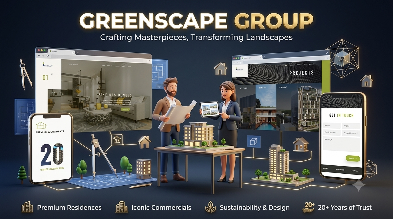
full-bleed visual pages per property with gallery and key specs.
site layout allowing users to explore building positions.
filter by BHK type, floor, and view to surface matching available units.
per-unit plan downloads with room dimensions.
gated PDF download requiring lead capture.
embedded 360° walkthrough integration for show flats.
contact form with project pre-selection and visit scheduling.
map with proximity data for schools, hospitals, and transit nodes.
icon-led feature grid with visual call-outs.
visual construction milestone tracker.
structured review section with buyer details.
dedicated compliance section showing registration numbers.
CMS-managed blog for announcements.
sticky floating button with pre-filled project inquiry message.
Monthly enquiry submissions rose 58% against the previous site, session duration on project pages grew 3.2×, and the WhatsApp CTA alone drove 34% of first-month enquiries.
Greenscape was a reminder that content strategy and UX design are the same job. Structuring developer differentiators into visible proof points drove conversions far more than pure aesthetics. Negotiating rigid CMS content models early prevented visual degradation over time.